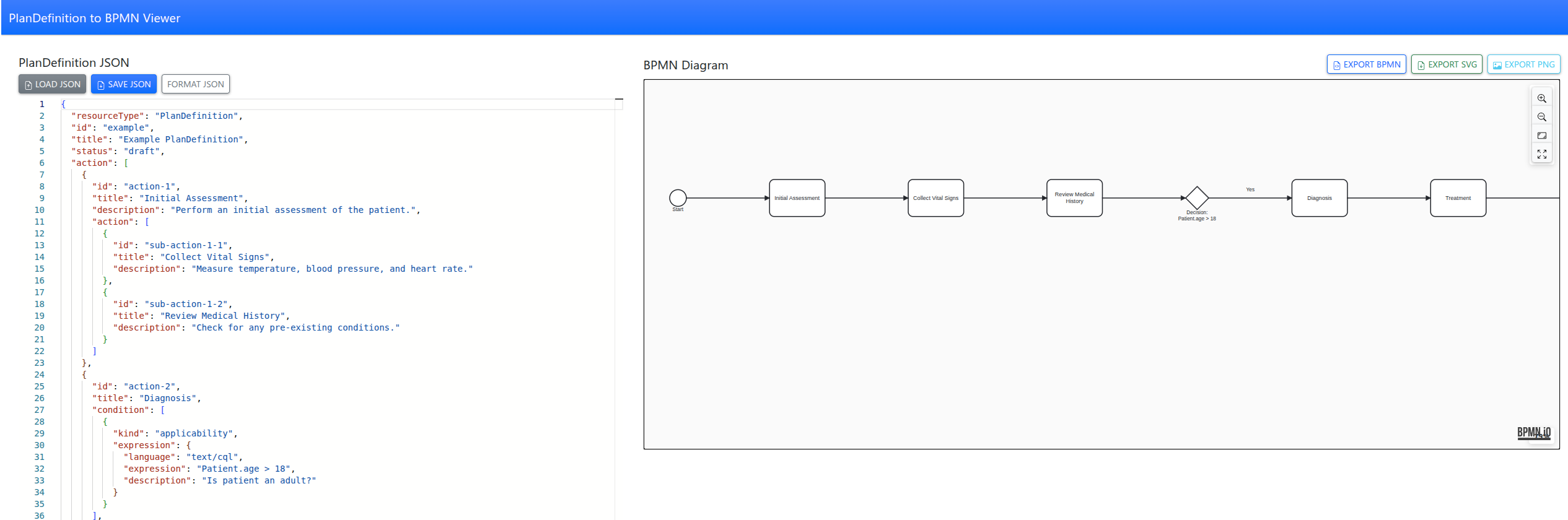
From FHIR PlanDefinition to BPMN: Visualizing Care Pathways
Tool to convert FHIR PlanDefinitions into interactive BPMN diagrams with a simple web app, making complex care pathways easy to visualize and understand.
FHIR
dbt
DuckDB
As a medical software architect, I’ve often found that the hardest part of building interoperable systems isn’t the data itself—it’s communicating the intent of that data. We spend months refining FHIR profiles and Extension Definitions, but when it comes time for a developer or a clinician to actually use our Implementation Guide (IG), they are often met with walls of tables and XML snippets.
Visualizations are the bridge between abstract data models and real-world clinical workflows. Over the last few years, the FHIR IG Publisher has evolved from a simple static site generator into a sophisticated toolchain for architectural visualization.
Today, we have three primary ways to bring our IGs to life: Mermaid, PlantUML, and the newly introduced Automated Class Diagrams. Let’s explore when and why to use each.
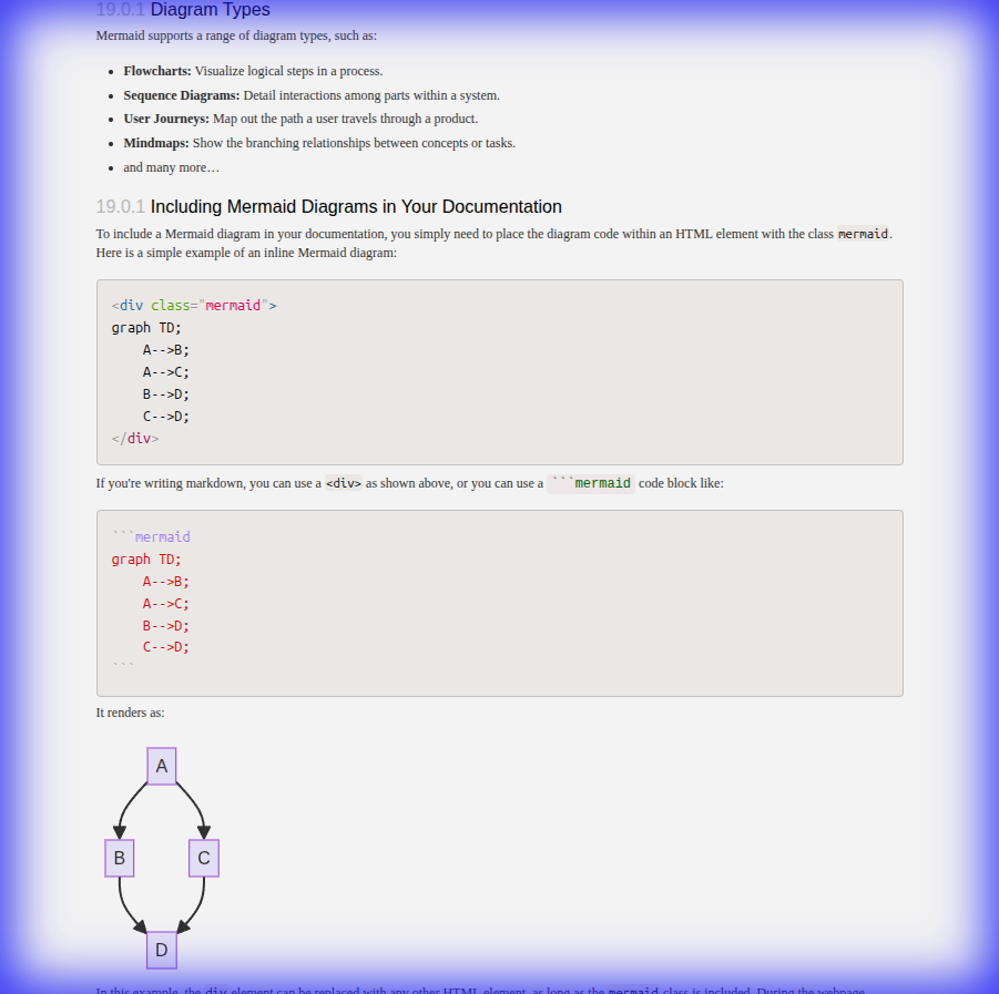
Mermaid is the “markdown for diagrams.” It’s a JavaScript-based tool that renders diagrams at runtime directly from text. Its greatest strength is its simplicity and the fact that it doesn’t require any external build tools or pre-processing.
In the IG Publisher, you can include Mermaid diagrams directly in your narrative pages.
<div class="mermaid">
graph TD;
    A[Patient Check-in] --> B{Existing Record?};
    B -- Yes --> C[Update Info];
    B -- No --> D[Create New Patient];
    C --> E[Proceed to Clinical Encounter];
    D --> E;
</div>
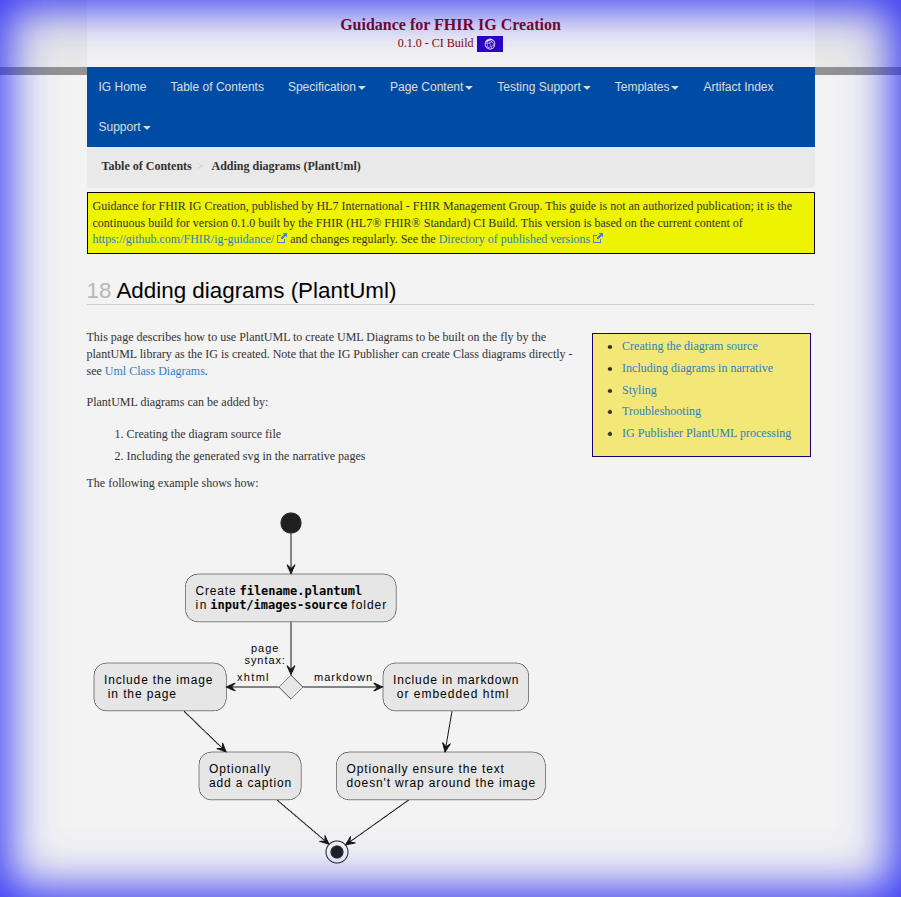
For more complex architectural needs, PlantUML has long been the gold standard. Unlike Mermaid, PlantUML diagrams are pre-rendered into SVG or PNG files during the IG build process. This makes them ideal for large, stable diagrams that require precise control over layout and styling.
In your input/images-source/ directory, you might have a file named resource-links.plantuml:
@startuml
skinparam handwritten false
skinparam class {
    BackgroundColor White
    ArrowColor Blue
    BorderColor DarkSlateGray
}

class Patient <<Resource>> {
    id: id
    identifier: Identifier
}

class Condition <<Resource>> {
    subject: Reference(Patient)
    code: CodeableConcept
}

Patient "1" <-right- "0..*" Condition : subject
@enduml
Perhaps the most exciting recent addition to the architect’s toolkit is the ability to generate UML Class Diagrams directly from StructureDefinitions.
Historically, we had to manually keep our diagrams in sync with our profiles—a process that was error-prone and tedious. Now, the IG Publisher can automatically extract the structure of your profiles and generate a “base” UML SVG.
generate-uml: source to your IG parameters.input/diagrams/.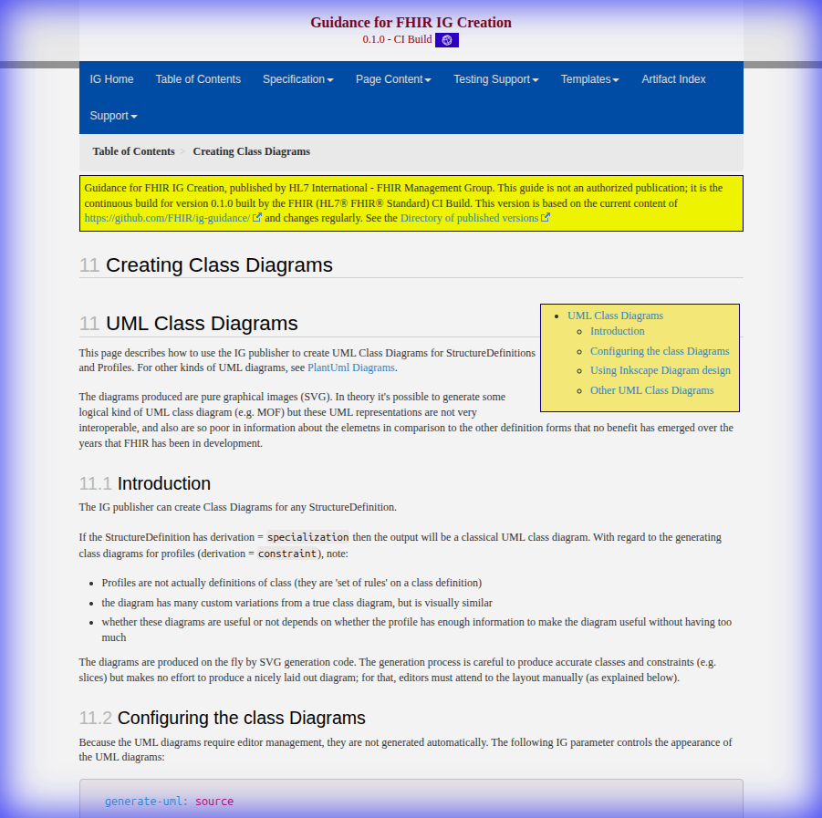
As architects, we must match the tool to the objective:
The ability to visualize clinical data structures is no longer a luxury; it’s a requirement for building the next generation of interoperable healthcare systems. With these three tools in your belt, you can ensure that your Implementation Guide is not just a specification, but a roadmap.
For more detailed guidance on setting up these features, check out the official HL7 UML Guidance.
Tool to convert FHIR PlanDefinitions into interactive BPMN diagrams with a simple web app, making complex care pathways easy to visualize and understand.
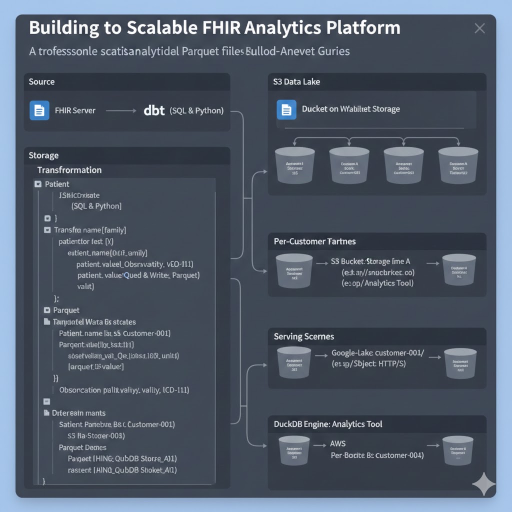
A professional guide to converting FHIR resources into analytical Parquet files using dbt, enabling secure multi-tenant analytics with DuckDB.

Fork of Microsoft FHIR Converter.

HAPI FHIR is a Java-based implementation of the HL7 FHIR (Fast Healthcare Interoperability Resources) standard for healthcare data exchange.

German FHIR Basis Profile for R4.